


As part of upgrading the image system (and the associated Club system so I can make a nice on forum Club thing in the right hand rail), I realised something: When you change which is the "default" theme on Proboards it doesn't update everyone that is currently using the previous default theme to the new default theme, just new users and non-registered people, everyone else carries on using the theme that was default when they joined. This was news to me. So for those experiencing the "new" theme for the first time, welcome to three months ago!
Some things to say straight off, yes I know the font is larger than it was, the avatars are round, and there is a right hand panel on every page (for some people) now! Some reasonings and where we're at with it all:
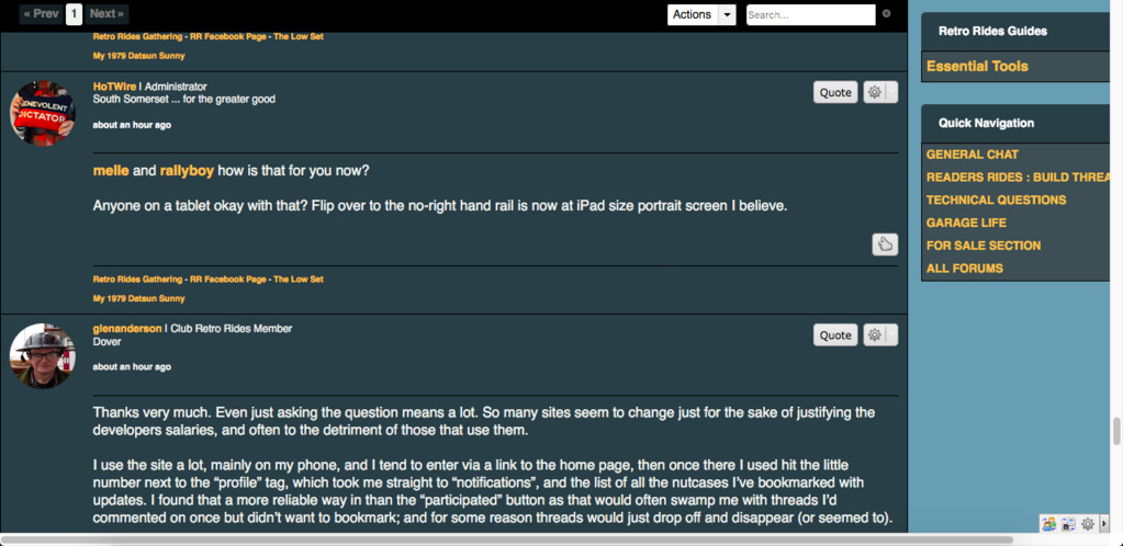
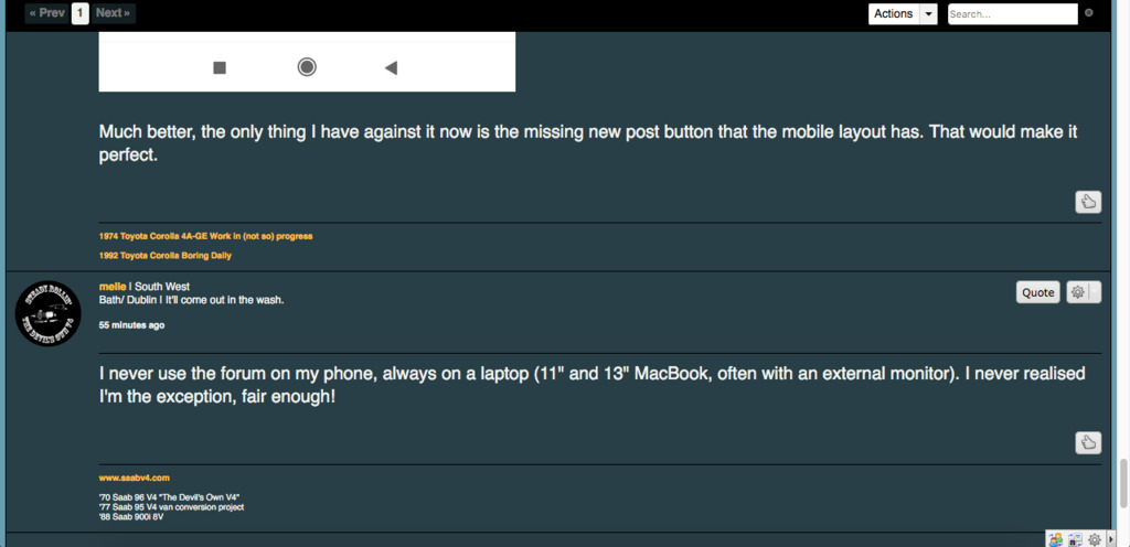
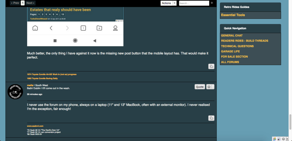
Font Size: The font size changes depending on what screen you are looking at it on, a full desktop has a size 16 font (and the right hand rail) as it goes down to the size of a tablet (in landscape mode) it loses the right hand rail and increases the font size to 20. Mobile is still a work in progress, but this changes layout again and increases font size. These font changes and associated line height changes are for readability, I didn't want to squeeze the content down the way BBC news or facebook does, but I did want to improve the readability on different devices and increase the size on standard desktop to 16 as a base line (it was also 20 at one point and was just tooooooo big). However this does mean that there are devices that are on the cusp of tablet to desktop that may need a bit more focus (like melle has found on his 13" Macbook). I went from industry standards for these break points and looked at our stats for devices, but they can certainly be worked on further.
Round Avatars: There is a new version of proboards on the way, it has round avatars, so I thought I'd get ahead of the situation and move over to them. The in thread layout is a bit closer to how the new boards will be too, although the Mini-profile on the left hand side of the thread is a bit more filled out in new probaords, the rest of it is pretty close. I'd like to revisit the top bar and mini-profile in the next few weeks now I've got some time again to concentrate on the forum layout.
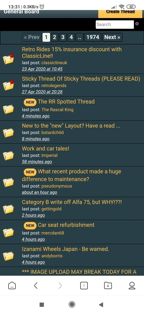
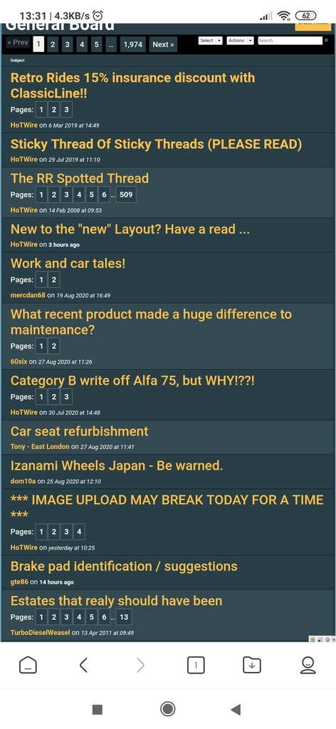
Right hand panel: For those on a big enough screen you'll have a right hand rail everywhere. I tried this before a few years ago but couldn't get it working without reducing the size of the content. As screen resolutions have changed it has allowed me to add the rail, with the navigation, recent threads and all that, without losing any size in the main content, in fact it is very slightly larger (only by a couple of pixels, but technically correct is the best kind of correct). If you are a Club Retro Rides member you shouldn't have adverts over there, but you will have a nice little Club Members display (soon!).
Talking of adverts, there are less adverts overall and hopefully they are slightly better placed. That is a work in progress as I need to balance visibility with interruption of reading flow on different devices.
Actually that is worth saying, the whole thing is a work in progress. I'm trying to get ahead of where I want to be when the new proboards is released (which is three years late already, but looking closer and closer to actually coming out). I'll be revisiting each bit of this whole thing, from the main forum listings, to the threads, to the mobile, to the avatar/info displays, to the right hand rail and navigation to ad placing and all that.
Happy to take constructive feedback, useful to know screen sizes, browsers and devices (if you know all three). Also any bits of info that are missing that you used to find useful, I tried to keep as much available at all times as I could in the avatar/info area, but I did remove a couple of things.
Some things to say straight off, yes I know the font is larger than it was, the avatars are round, and there is a right hand panel on every page (for some people) now! Some reasonings and where we're at with it all:
Font Size: The font size changes depending on what screen you are looking at it on, a full desktop has a size 16 font (and the right hand rail) as it goes down to the size of a tablet (in landscape mode) it loses the right hand rail and increases the font size to 20. Mobile is still a work in progress, but this changes layout again and increases font size. These font changes and associated line height changes are for readability, I didn't want to squeeze the content down the way BBC news or facebook does, but I did want to improve the readability on different devices and increase the size on standard desktop to 16 as a base line (it was also 20 at one point and was just tooooooo big). However this does mean that there are devices that are on the cusp of tablet to desktop that may need a bit more focus (like melle has found on his 13" Macbook). I went from industry standards for these break points and looked at our stats for devices, but they can certainly be worked on further.
Round Avatars: There is a new version of proboards on the way, it has round avatars, so I thought I'd get ahead of the situation and move over to them. The in thread layout is a bit closer to how the new boards will be too, although the Mini-profile on the left hand side of the thread is a bit more filled out in new probaords, the rest of it is pretty close. I'd like to revisit the top bar and mini-profile in the next few weeks now I've got some time again to concentrate on the forum layout.
Right hand panel: For those on a big enough screen you'll have a right hand rail everywhere. I tried this before a few years ago but couldn't get it working without reducing the size of the content. As screen resolutions have changed it has allowed me to add the rail, with the navigation, recent threads and all that, without losing any size in the main content, in fact it is very slightly larger (only by a couple of pixels, but technically correct is the best kind of correct). If you are a Club Retro Rides member you shouldn't have adverts over there, but you will have a nice little Club Members display (soon!).
Talking of adverts, there are less adverts overall and hopefully they are slightly better placed. That is a work in progress as I need to balance visibility with interruption of reading flow on different devices.
Actually that is worth saying, the whole thing is a work in progress. I'm trying to get ahead of where I want to be when the new proboards is released (which is three years late already, but looking closer and closer to actually coming out). I'll be revisiting each bit of this whole thing, from the main forum listings, to the threads, to the mobile, to the avatar/info displays, to the right hand rail and navigation to ad placing and all that.
Happy to take constructive feedback, useful to know screen sizes, browsers and devices (if you know all three). Also any bits of info that are missing that you used to find useful, I tried to keep as much available at all times as I could in the avatar/info area, but I did remove a couple of things.


 As my eyes seem to be getting tired faster, the larger font on my laptop is very welcome!