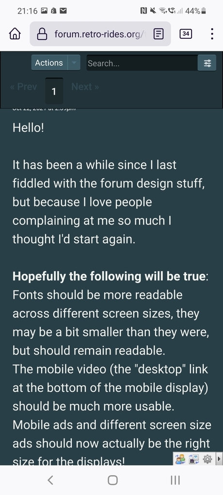
Hello!
It has been a while since I last fiddled with the forum design stuff, but because I love people complaining at me so much I thought I'd start again.
Hopefully the following will be true:
Fonts should be more readable across different screen sizes, they may be a bit smaller than they were, but should remain readable.
The mobile video (the "desktop" link at the bottom of the mobile display) should be much more usable.
Mobile ads and different screen size ads should now actually be the right size for the displays!
Adjusted paging sizes so they display (relative to the screen) the same size across different sizes.
Adjusted the Reply box on Mobile desktop view so it is actually usable!
Things I've still yet to do:
Work out what is going on with the "new" icon* (as per this thread)
Tidy up the top menus on the mobile desktop display
Tidy up the colouring on the menus in the Thread create dialog
There is more to come (there is always more to come), but I'm hoping these small improvements will help make the site a bit more usable on different devices, so that when I implement stuff that only works in the desktop view for mobile, it can be used by the majority of you.
Thanks for your continued use of the forum
* I did have a look at this, but it all looks to be "correct"
It has been a while since I last fiddled with the forum design stuff, but because I love people complaining at me so much I thought I'd start again.
Hopefully the following will be true:
Fonts should be more readable across different screen sizes, they may be a bit smaller than they were, but should remain readable.
The mobile video (the "desktop" link at the bottom of the mobile display) should be much more usable.
Mobile ads and different screen size ads should now actually be the right size for the displays!
Adjusted paging sizes so they display (relative to the screen) the same size across different sizes.
Adjusted the Reply box on Mobile desktop view so it is actually usable!
Things I've still yet to do:
Work out what is going on with the "new" icon* (as per this thread)
Tidy up the top menus on the mobile desktop display
Tidy up the colouring on the menus in the Thread create dialog
There is more to come (there is always more to come), but I'm hoping these small improvements will help make the site a bit more usable on different devices, so that when I implement stuff that only works in the desktop view for mobile, it can be used by the majority of you.
Thanks for your continued use of the forum

* I did have a look at this, but it all looks to be "correct"