|
|
|
Nov 16, 2024 15:55:52 GMT
|
|
Okay this isn't a massive leap visually from the previous one, but here is what I've done:
Tidied up a few visual bits and pieces that were bothering me, still LOADS of these to do.
Changed the image uploader so it puts in placeholders for the images, so they SHOULD be in the order they are when selected, although they may be in the order they are on your device. Either way, they aren't totally random.
Fixed a few performance issues, including the editor box losing focus when ads refresh on the page, fingers crossed that works consistently now.
I've changed the way the listings page is structured from an HTML point of view, which gives me greater control on how it looks at various sizes, and more flexibility in how it is laid out. I think the mobile view is a bit sparse currently, so that will be first on the list for next round of improvements.
Give me a shout if anything looks very odd. Will need to know what device you are using, and ideally what browser you are using.
|
| |
|
|
|
|
|
|
|
Nov 16, 2024 21:38:32 GMT
|
It looks a bit bland unless you log in? Or is that correct?  |
| |
|
|
|
|
|
Nov 16, 2024 22:14:06 GMT
|
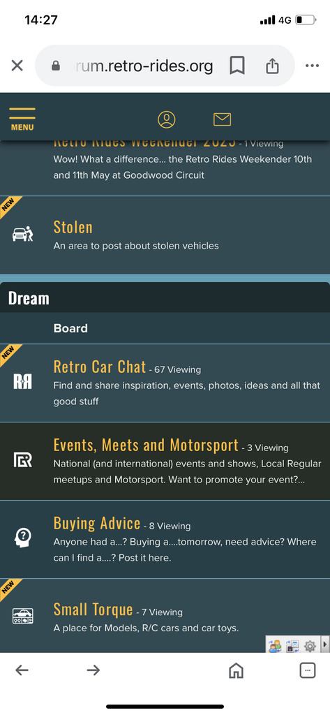
gtvivaI think the mobile view is a bit sparse currently, so that will be first on the list for next round of improvements. The login stuff appears to be messed up mobile. I've also had screen width glitch a little as I type this on mobile, so something else to look at tomorrow.
|
| |
|
|
zeberdee
Club Retro Rides Member
Posts: 1,041  Club RR Member Number: 2
|
|
Nov 18, 2024 14:24:03 GMT
|
I seem to have lost part of the main screens . New posts etc It also doesn’t take me too the last post i read , it just goes straight to the first post  Mobile iPhone Home Screen seems fine  |
| |
Last Edit: Nov 18, 2024 14:27:55 GMT by zeberdee
|
|
Davey
Posted a lot
   Resident Tyre Nerd.
Posts: 2,348
|
|
Nov 18, 2024 14:48:49 GMT
|
|
Yeah the new tag has gone on threads for me, just a different shade of blue.
|
| |
K11 Micra x3 - Mk3 astra - Seat Marbella - Mk6 Escort estate - B5 Passat - Alfa 156 estate - E36 compact
Mk2 MR2 T-bar - E46 328i - Skoda Superb - Fiat seicento - 6n2 Polo - 6n polo 1.6 - Mk1 GS300
EU8 civic type S - MG ZT cdti - R56 MINI Cooper S - Audi A3 8p - Jaguar XF (X250) - FN2 Civic Type R - Mk2 2.0i Ford Focus - Mercedes W212 E250
|
|
misteralz
Posted a lot
   I may drive a Volkswagen, but I'm scene tax exempt!
Posts: 2,495
|
|
Nov 18, 2024 14:56:41 GMT
|
|
Same!
|
| |
|
|
|
|
|
Nov 18, 2024 15:11:08 GMT
|
|
Will be returning, apologies. It was on a list of things to do, and then when I copied that list one day I forgot to include it.
Will get it sorted this week. Sorry.
|
| |
|
|
adam73bgt
Club Retro Rides Member
Posts: 4,998
Club RR Member Number: 58
|
|
Nov 18, 2024 16:01:09 GMT
|
I've got some funky formatting going on in the participated threads list on mobile (Chrome browser) in both portrait and landscape modes   |
| |
|
|
|
|
|
Nov 18, 2024 16:36:43 GMT
|
This is what I see, Samsung S20 using chrome: Portrait, no "New" flag as mentioned Landscape, some overlapping formatting Thanks   |
| |
|
|
|
|
|
Nov 18, 2024 17:12:10 GMT
|
|
Thanks chaps, will look at all those.
I ALWAYS forget to check the Participated list, sorry.
|
| |
|
|
|
|
|
|
|
Nov 18, 2024 18:13:38 GMT
|
|
Found the new button, is is slightly in the wrong place at the moment, but it is at least back on the board.
Participated Threads display is an absolute mystery. I thought it would be following the thread listing display that forums and search now follow, but it appears to still be in the old style of structure. I'll see if I can work that out some how.
Going to look at adding a bit more info to the mobile display first, and then the landscape size on a mobile too (which is likely affecting tablets too (if anyone can confirm??))
|
| |
|
|
|
|
|
Nov 18, 2024 19:11:16 GMT
|
TravellingNigel give the landscape view a go again. I have a fix (of sorts) in but not fully tested yet.
|
| |
|
|
jimi
Club Retro Rides Member
Posts: 2,223  Member is Online
|
|
Nov 18, 2024 19:19:17 GMT
|
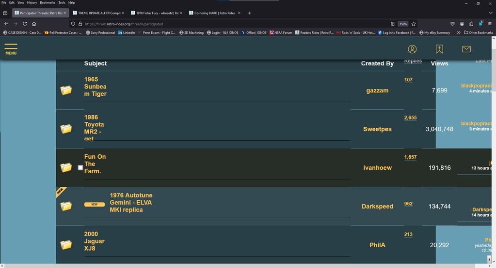
Phone (S20) and tablet (8" Lenovo) seem fine on Recent Threads and Forums. Participated has strange formating on both. Seems to be related to the Thread Title which looks like it's being wrapped to a smaller horizontal size than the available space, so if it ends up on 3 lines it looks OK 4 lines and it runs out of vertical space. EDIT Formatting is bit off on the Recent Threads page, the OP's avatar is on the left and their name is on the right, also no avatar for the last poster. I'll get a screenshot .... Landscape on a tablet using Chrome  |
| |
Last Edit: Nov 18, 2024 19:41:50 GMT by jimi
Black is not a colour ! .... Its the absence of colour
|
|
|
|
|
Nov 18, 2024 20:01:00 GMT
|
TravellingNigel give the landscape view a go again. I have a fix (of sorts) in but not fully tested yet. Thanks HoTWireThis is what I see now, Samsung S20, Chrome - Portrait now shows the avatar for the thread creator on the left and the "new" indicator on the right - Landscape there is still some overlap- looks like there is not enough room for multiple lines for both the thread title and the number of pages That made me notice that the number of pages does not show on the portrait layout (they show as soon as you go into the thread, so that's fine), so maybe that is the solution for the Landscape format? Thanks   |
| |
|
|
|
|
|
|
|
|
Just looking at the main retro car chat and the threads are repeating over and over? Just me, or can anyone else see the same? It is on my phone and desktop too?
|
| |
|
|
jimi
Club Retro Rides Member
Posts: 2,223  Member is Online
|
|
Nov 19, 2024 11:25:32 GMT
|
Yes, I can see the same, if you select page 2 it says page 2 but is still showing page 1. While it's on page 2 if you refresh the browser page it will display page 2  EDIT All the forum sections, including Recent Threads are doing the same |
| |
Last Edit: Nov 19, 2024 11:29:19 GMT by jimi
Black is not a colour ! .... Its the absence of colour
|
|
|
|
|
Nov 19, 2024 12:01:26 GMT
|
|
I don't know if that is my fault... I'll go check the support forum.
|
| |
|
|
jimi
Club Retro Rides Member
Posts: 2,223  Member is Online
|
|
Nov 19, 2024 12:39:26 GMT
|
Ooh the mobile editor got fancy  |
| |
Black is not a colour ! .... Its the absence of colour
|
|
|
|
|
Nov 19, 2024 13:24:28 GMT
|
Participated is really weird for me - windows 10 & Firefox.  |
| |
|
|
|
|
|
Nov 19, 2024 13:27:28 GMT
|
Yes, I can see the same, if you select page 2 it says page 2 but is still showing page 1. While it's on page 2 if you refresh the browser page it will display page 2  EDIT All the forum sections, including Recent Threads are doing the same Yup think this is my theme, no errors in console, put a support message in with Proboards... Apologies folks. Probably missing an element on the page somewhere for it. Have done a couple more updates to the different sizes of layouts, hopefully less overflowing or squashed links. Pagination for threads back on mobile. Got a few more bits to do in that regard as there are still long thread titles that push things out of place, I have a fix, I need to implement it. Board pagination works again, worked it out, I did a stupid thing. Going to see if I can get some help on the in-thread pagination going to the top of the next page thing though. |
| |
Last Edit: Nov 19, 2024 13:43:56 GMT by HoTWire
|
|
|
|


 [*]
[*] [*]
[*]


